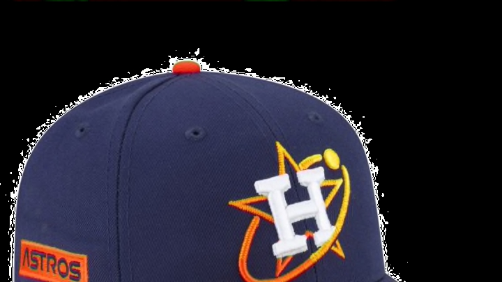
Here are my thoughts on the Astros Nike City Connect jerseys.
The jersey itself is blue with orange or the tequila sunrise gradient font and accents. I like the blue, but I would prefer for it to be a darker shade, more like the Colt .45’s color scheme.
Let’s start from the top down. On the inside of the neck, there is a moon lander depiction with the phrase “Go for Launch”. I think this pays great homage to the Space theme. The Nike swoosh is gold, as it is supposed to symbolize the gold insulation on space mission equipment, but the first thing I thought of when seeing it was the World Series championship.
I think many fans thought this as well. It reminded me of the gold or silver pieces Nike added to their March Madness jerseys this year, depending on if the team has previously won a championship or not. Across the chest are the words “Space City”, again in the Nasa-like font.
I saw a mock where “Space” and “City” were on top of each other on one side, and a number on the other, which I think looks better, but this is not bad. The shoulders have a grid pattern to represent star charts, which looks good, but the biggest miss on this jersey is not having this pattern throughout the entire jersey.
That would have taken this from a good jersey, to a great jersey. There’s a Texas patch on the left shoulder, with every Houston area code. This is a good choice, as it resembles the true NASA astronaut suits.
I absolutely love the gradient piping used throughout the jersey, which is based on the 70s rainbow staple. The jersey is complemented by blue pants and a blue hat, to help it look even more like a true NASA suit, which I love.
I dislike the pant numbers used in the 70s jerseys originally, but I like that they incorporated it here for nostalgia. Again, the main thing missing from this jersey is the shoulder star chart pattern, not continuing through the entire jersey.
